


The work.
Overview.
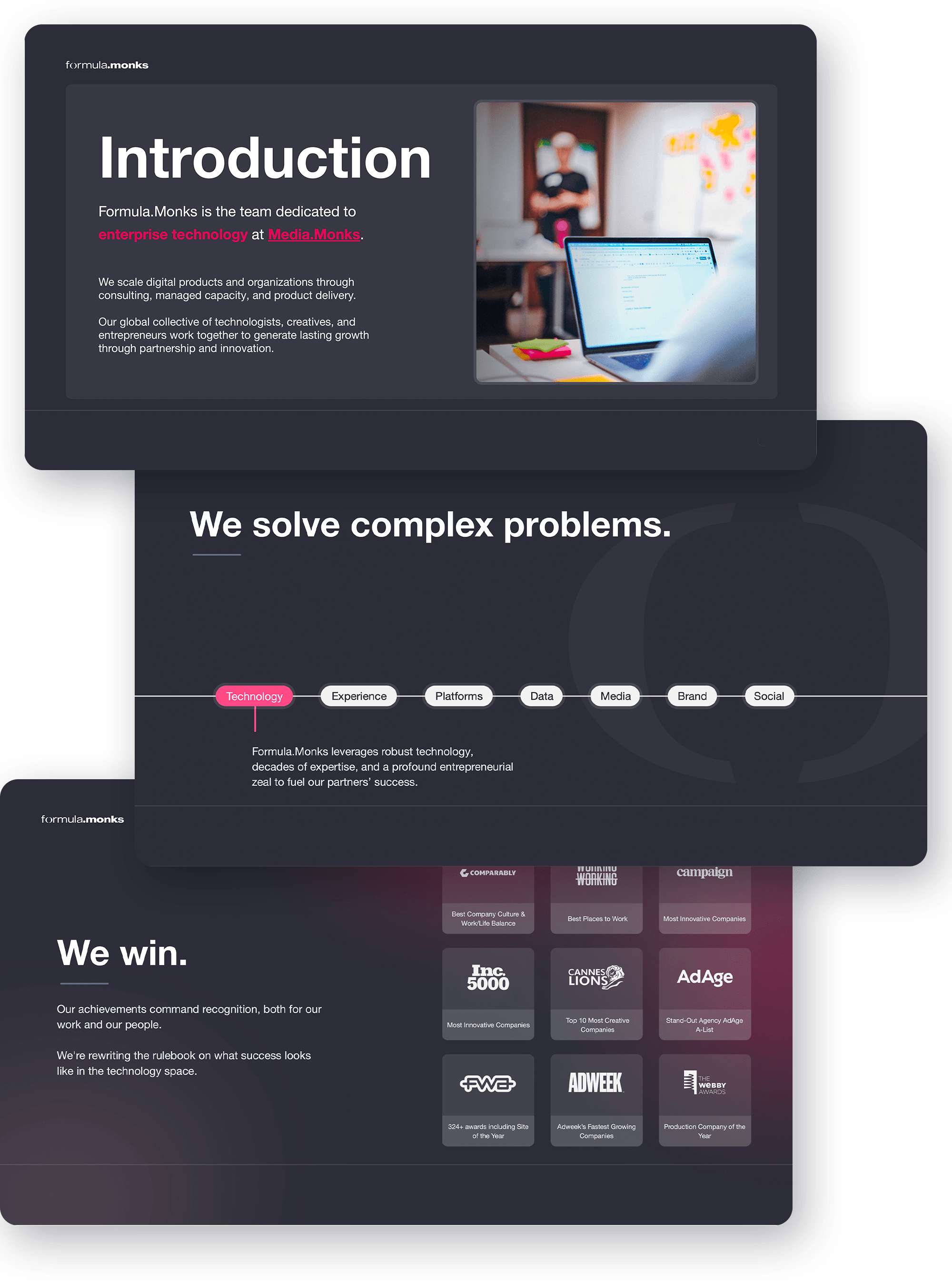
In late 2023, I was brought in to Monks to solve a delicate problem: how do you merge two powerhouse tech consultancies, TheoremOne and Zemoga, into a single, unified identity under Monks without losing the soul of either? The merger created Formula.Monks, a new division focused on enterprise software and consulting. But the challenge was clear. Our audience wasn’t ad execs. It was CTOs, CIOs, and digital transformation leads. And the loud, colorful energy of the Monks brand wasn’t going to cut it. My role was to recalibrate. I built a brand system that honored the legacy of both TheoremOne and Zemoga, weaving in their cultural and visual DNA while scaling back the more exuberant elements of Monks. The result was a visual identity that felt credible in the boardroom and authentic to the teams who built it. A brand that could walk into an enterprise meeting and feel right at home.
Research.
In early conversations with Brady Brim-Deforest, then CEO of Formula.Monks, it became clear that we needed to dig deep before making any design decisions. The merger of TheoremOne and Zemoga deserved more than a logo swap. We studied how each brand showed up on its own and how those identities could sit naturally within the broader Monks ecosystem. The goal was simple: build something that felt distinct but never disconnected.
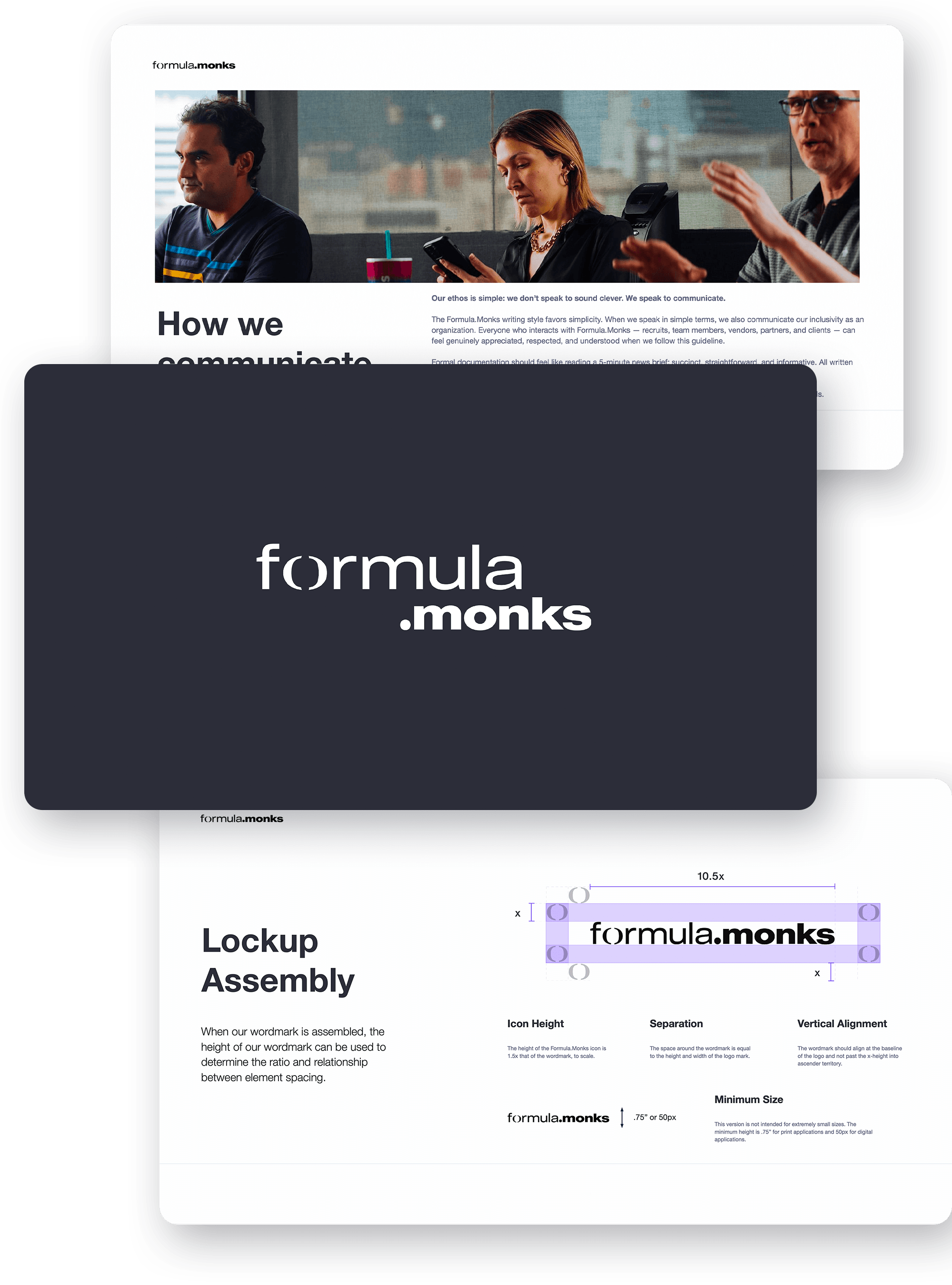
To get there, we stripped back some of the louder visual cues. Animations were dialed down. Scribbles and bright backgrounds gave way to tighter grids, calmer tones, and more deliberate design choices. We kept the bold type, the vibrant accents, and the sharp modern feel, but made sure everything served the story rather than distracting from it.
Color conscious.
The official Monks color palette included 11 core colors, plus pastel and tinted variations, bringing the total to 33. Without clear use cases, accessibility standards, or documentation, things quickly leaned more into creative interpretation than consistency.
For Formula.Monks, I took a different approach. The goal was to ground the brand with a more restrained palette and give teams the structure they needed to work confidently within it. I narrowed things down to a set of neutrals, primary and secondary tones, and subtle overlays. In the end, the identity centered around just three signature colors: Formula.Red, Formula.Blue, and Formula.Green. With strong guidelines and pre-built assets in place, teams could move fast without second-guessing the system.
Align and define.
Since joining forces with S4 Capital in 2018, Monks has been in full ascent. The agency has picked up serious momentum, landing on Adweek’s Fastest Growing lists year after year, breaking into Cannes Lions’ Top 10 Creative Companies, and holding its place in AdExchanger’s Programmatic Power Players for five straight years. That kind of growth called for more than just creative horsepower. It needed real technical firepower too.
Enter Formula.Monks. A tech-forward services group built to accelerate business and rethink how brands and systems interact. I am grateful to Brady Brim-Deforest and Sir Martin Sorrell for trusting me to shape the identity that would bring Formula.Monks into the fold. The result was a brand that carries the energy of Monks but stands tall on its own, clear, refined, and built with intention.
Before launch, we equipped the team with hundreds of ready-to-use slide decks, templates, and a folder system designed for collaboration across disciplines. There were early doubts from some corners of the creative team, but the final product won them over. What we delivered was more than just a look and feel. It was a brand the team could believe in, and one that fits seamlessly into the broader Monks ecosystem.
Press.
"Having witnessed his work first-hand, I know how much dedication and care he puts into every project. He should feel immensely proud to see this world-class brand come to life. I always get to witness his talents every day, but I'm so proud the rest of the world gets to see it too!"
More with
Monks
More client partnerships
Please note that this portfolio is undergoing active updates and contains an extensive back catalog.
(Last updated: Feb. 28, 2025)